 Header Images TutorialBy:
 Bookie
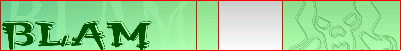
Final Result In my opinion, one of the most important things to remember when making your UBB, is to make it so it can be viewed correctly on any computer no matter the shape or size. I'm going to help you get started on that, and better yet, in style. That's right, fasten your seatbelts because we're making headers!
Of course it would be too easy to design graphics if everybody used the same resolution, so just to through a bit of a challenge in there, we are not going to make any ordinary header, this one will fit on almost all resolutions, without the user having the image too small or too big.
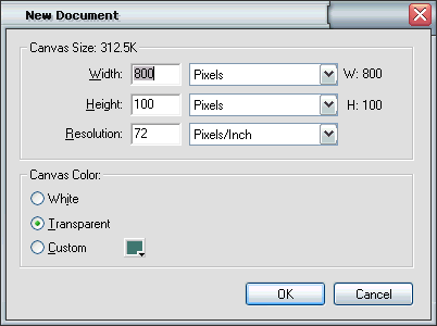
Part One: Playing With FireworksLet's get started, launch up fireworks (the program that is), and create a new document. A good size to start with for a header is about 800x100. You don't want to make the beginning document too big in height because we have to remember our good friends using the 56k modems, and we don't want to leave them out either.
Once you have the new document open, we start by creating a base, or a background by this. The background is going to be a background image, so we have to use something continuous, gradients work well here. Select the rectangle tool (

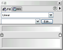
), and make a rectangle that covers the entire canvas. Open up the fill docker (window > fill), and be sure to have the rectangle selected. Click on the dropdown menu where solid is selected, and select "linear". This will give you a linear type fill, but not only is it in the wrong direction, it is the wrong colors too! Uh oh... we better fix that. We will start with the colors. Click on the edit beside where it has the dropdown menu with "Black, White" selected. This brings up a small popup where you can adjust the gradient settings. In this tutorial I used the colors #CCCCCC and #FFFFFF. You can change the colors by simply clicking one of the two color tabs, and putting in the color, or selecting one of your own.
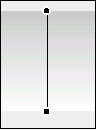
Now, we have the sideways gradient, but we want it to go up and down so we can use it as a background in the header. Select the Pointer Tool (

), and make sure the rectangle is selected. Now you've got a line with a black circle on one end, and a back square on the other. Click and drag the shaped and adjust them so they are verticle, instead of horizontal.
Now that we have a base for our header image, its time to think about what we are going to put on it. Usually just some basic text on the left side, and a logo, or other image on the right. Here I used a few odd fonts, for the text I used Orbus Multiserif and Demon (available at
Font Empire ), and on the right side is a dingbat from the font
Marines .
Using the letter D in the Marines font, I added a black border to the dingbat, I also added the reverse gradient fill of the background. Reverse it by simply switching the circle and square, but remember to use the pointer tool to get it to display! Then I clones the dingbat (edit > clone), and set turned off the fill.

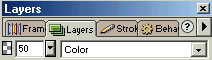
Now that the dingbat has only a border, use the arrow keys and put it out of place a few pixels up and left. Do the same thing but move it in the opposite direction to get that effect. Then celect the 3 dingbas (shift+click), and open
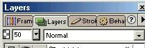
up the layers docker (window > layers). Set the opacity to about 50%, and that should be looking nice by now.
Now, the last part, creating the text. Use the settings as seen in the picture below.
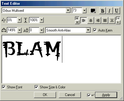 |
Note: Be sure you have anti-aliasing on, or your text will be jagged. Here I have Smooth Anti-Alias selected.
The image settings are quite straight forward, but if you are confused you may check out this link. |
Continued on page 2...


